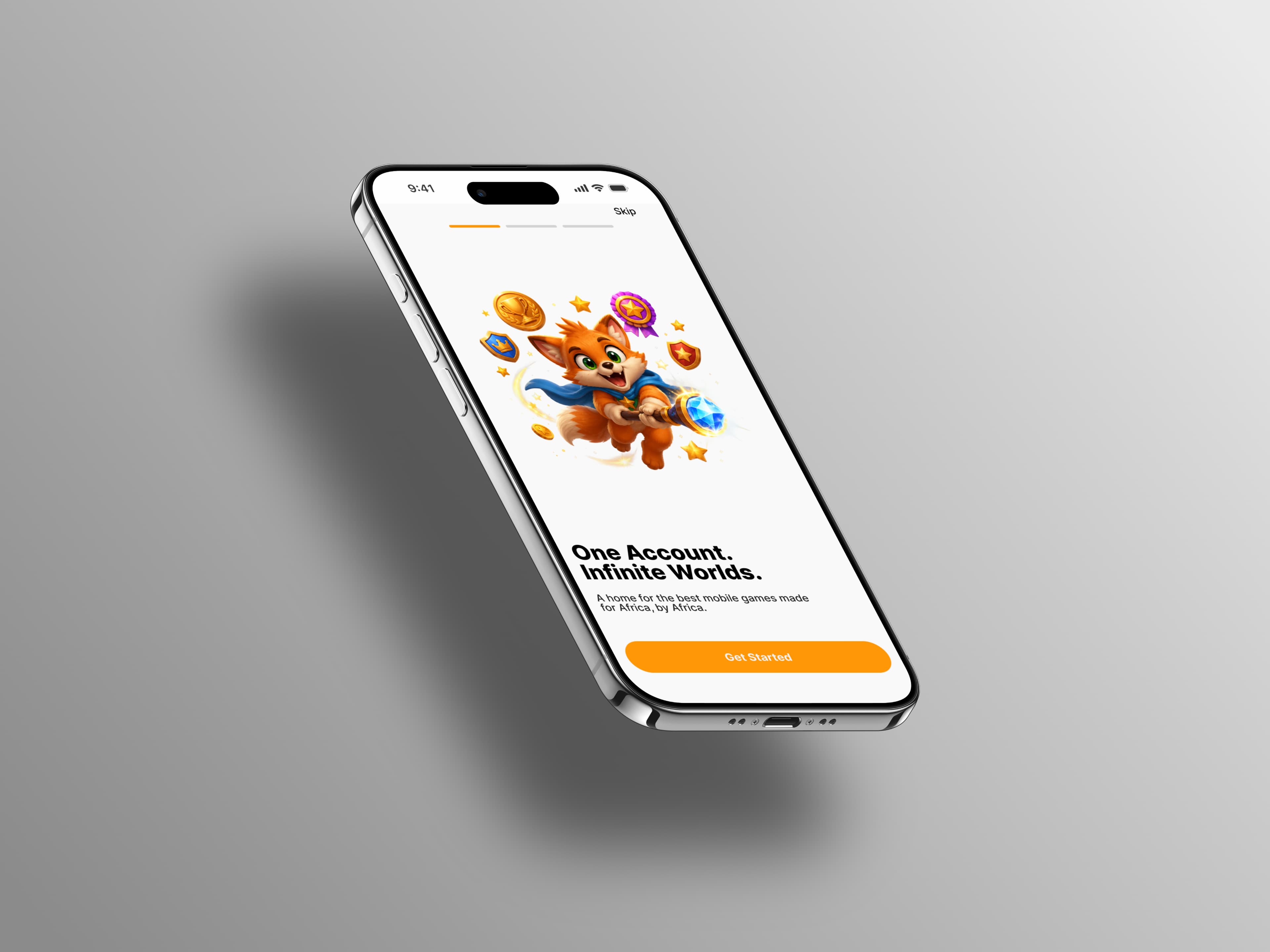
UI/UX Design · Mobile · Product Redesign
Fefe
Fefe is a mobile gaming platform designed to bring game discovery, purchasing, and play into one experience.
Overview
Redesigning Fefe for a more cohesive product experience
Fefe is a mobile gaming platform where users can discover games, explore game information, purchase games, and manage their gaming activity.
The project began with an existing Fefe design that established the product concept and core functionality. Before implementation, the experience needed to be revisited—bringing its different flows into a more cohesive visual and interaction system while refining the overall product experience.
I worked alongside another UI/UX designer, with each of us owning specific product areas while collaborating on the overall direction.
My contribution — I owned Home, Search, My Games, Game Details UI, Per-game Leaderboard, Settings, and 50% of Onboarding. My work covered the interface design, interaction patterns, states, and visual refinement across these areas.
Research
Product & visual exploration
Because Fefe was a redesign rather than a new product concept, our initial exploration focused on understanding how established gaming and storefront experiences solve similar problems.
We looked at Netflix Games, Apple Arcade, the App Store, PlayStation/Sony, and other gaming products for inspiration around discovery, game presentation, navigation, ratings, purchasing, and content hierarchy.
01
Discovery should feel visual
Game artwork and featured content should immediately communicate what is available to play.
02
Familiar patterns reduce friction
Existing storefront conventions around search, ratings, categories, and purchasing provide useful patterns users already understand.
03
Information should be easy to scan
Game details need clear hierarchy so users can quickly understand what a game is and whether they want to play it.
04
The product needs its own identity
The interface should feel distinctly like a gaming platform rather than simply another mobile storefront.
Design Process
Reworking the existing experience
The redesign started from the earlier Fefe product direction rather than a blank canvas.
The existing design already covered areas such as onboarding, authentication, discovery, game details, search, My Games, profile, settings, purchasing, and leaderboards.
Our task was to rethink and refine the experience before implementation, rather than simply reproduce the existing screens.
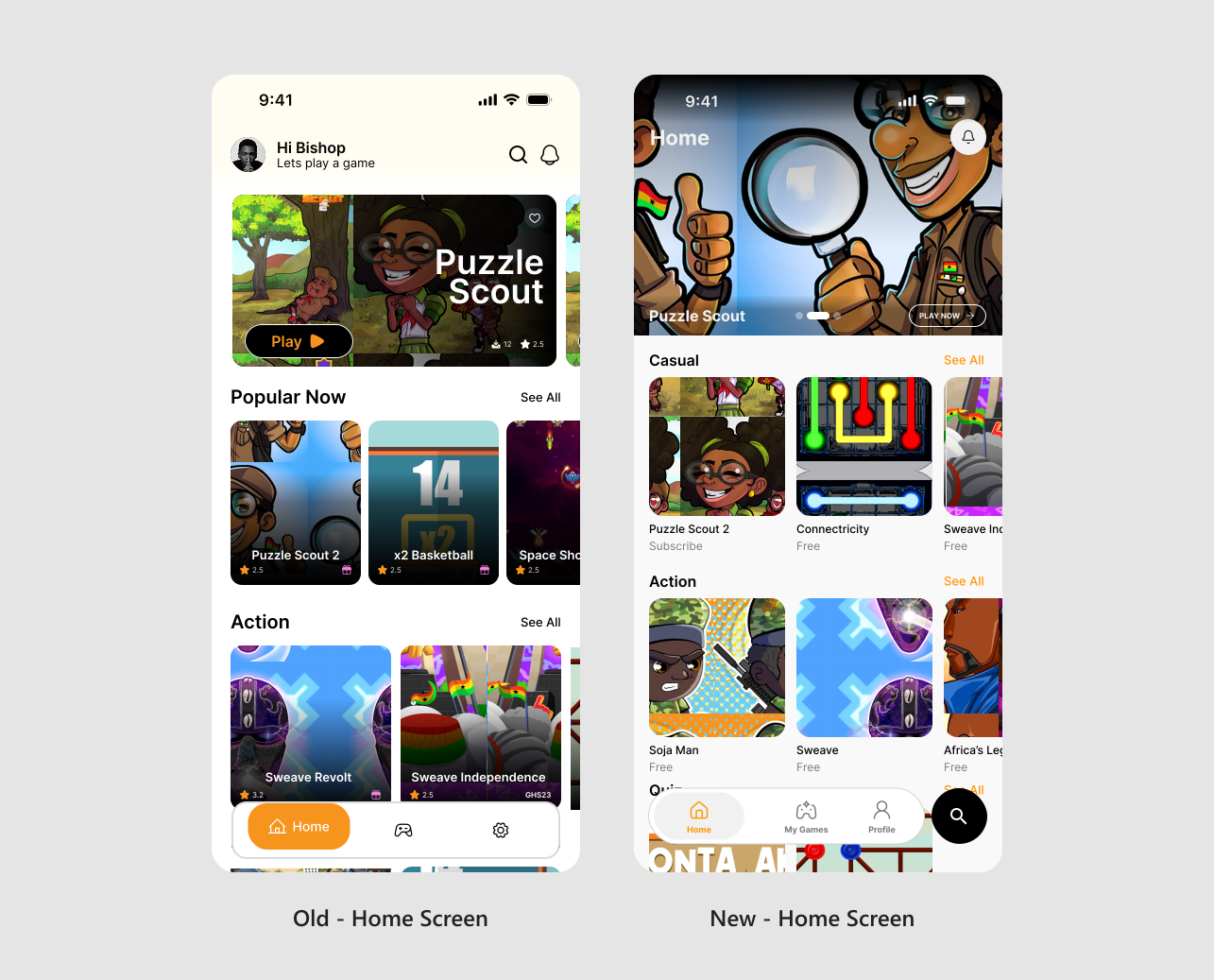
Home
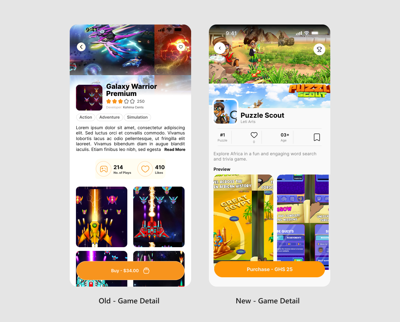
Game Details
Search / Discovery
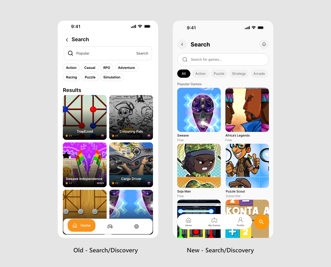
The redesign introduced a more cohesive visual language, clearer hierarchy, and more consistent interaction patterns across the product.
Discover
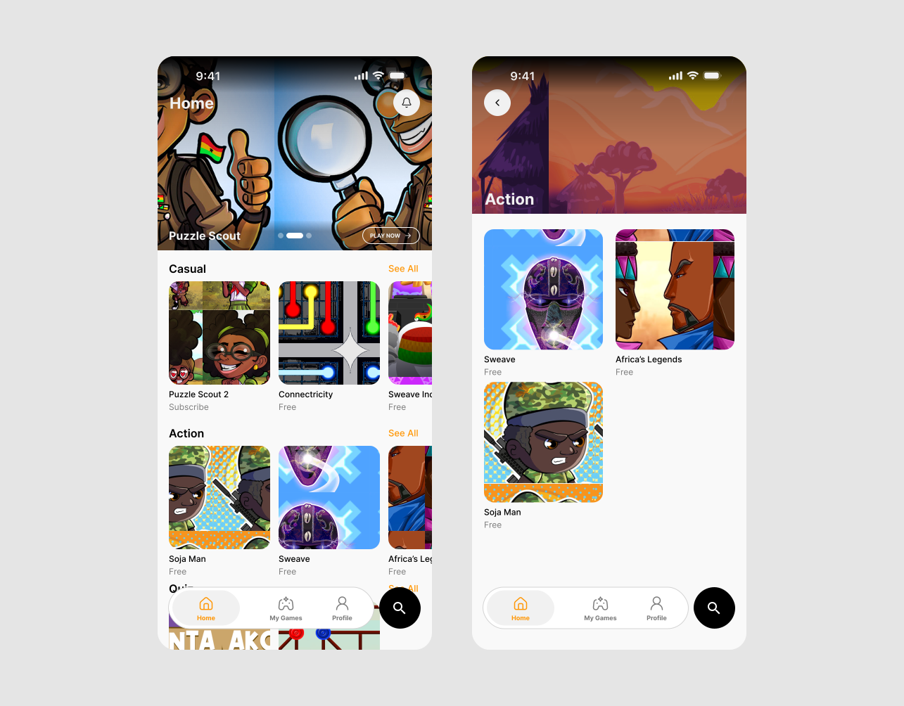
The experience begins with helping users find something worth playing. Home brings together featured games, popular titles, categories, ratings, pricing, and search so users can begin exploring immediately.
Explore
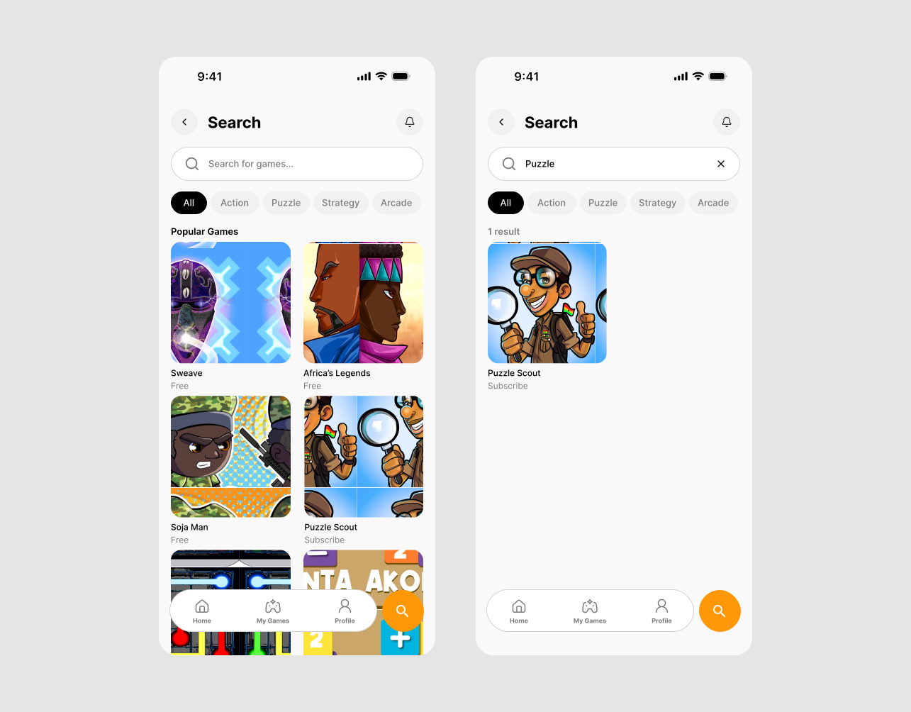
Once users know what they're looking for—or want to browse more intentionally—Search provides a focused route into the catalogue. Users can search for specific games and move from their query into relevant results.
Decide
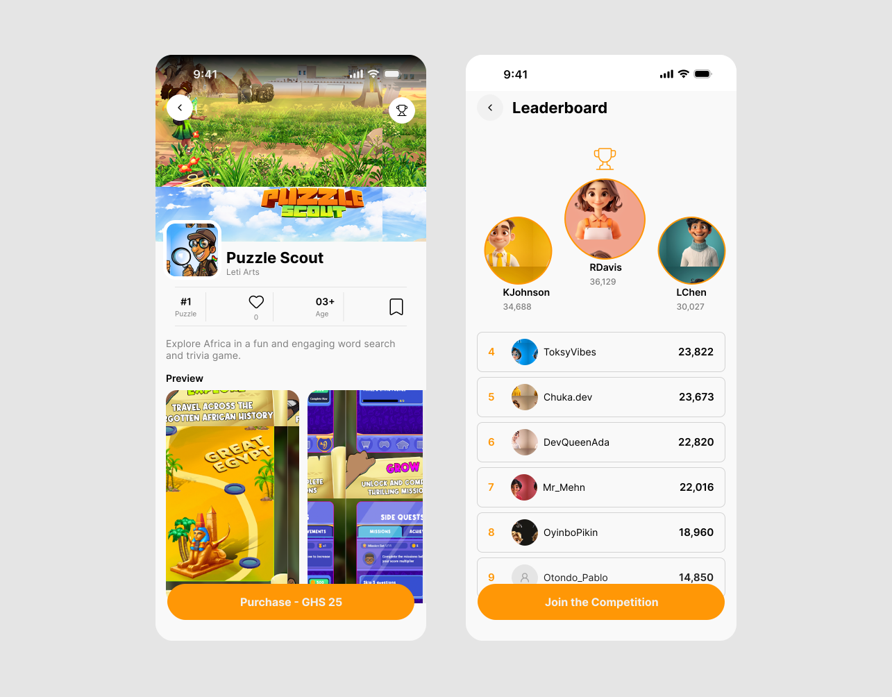
Game Details is where users evaluate a game before deciding what to do next. I designed the Game Details experience to bring together game artwork, title and category, rating, developer, description, reviews, game statistics, primary play/purchase action, and leaderboard access.
Play
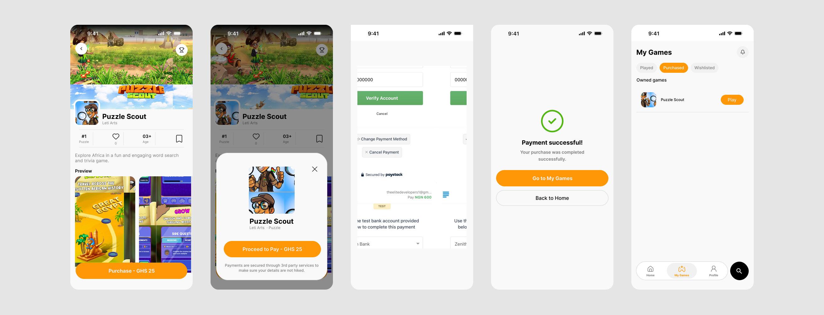
After deciding to play, users move through the purchase or play experience and can access their games through My Games. Purchase states were designed beyond the successful path, giving users clear feedback and next steps when something goes wrong.
Design System
Building a reusable UI foundation
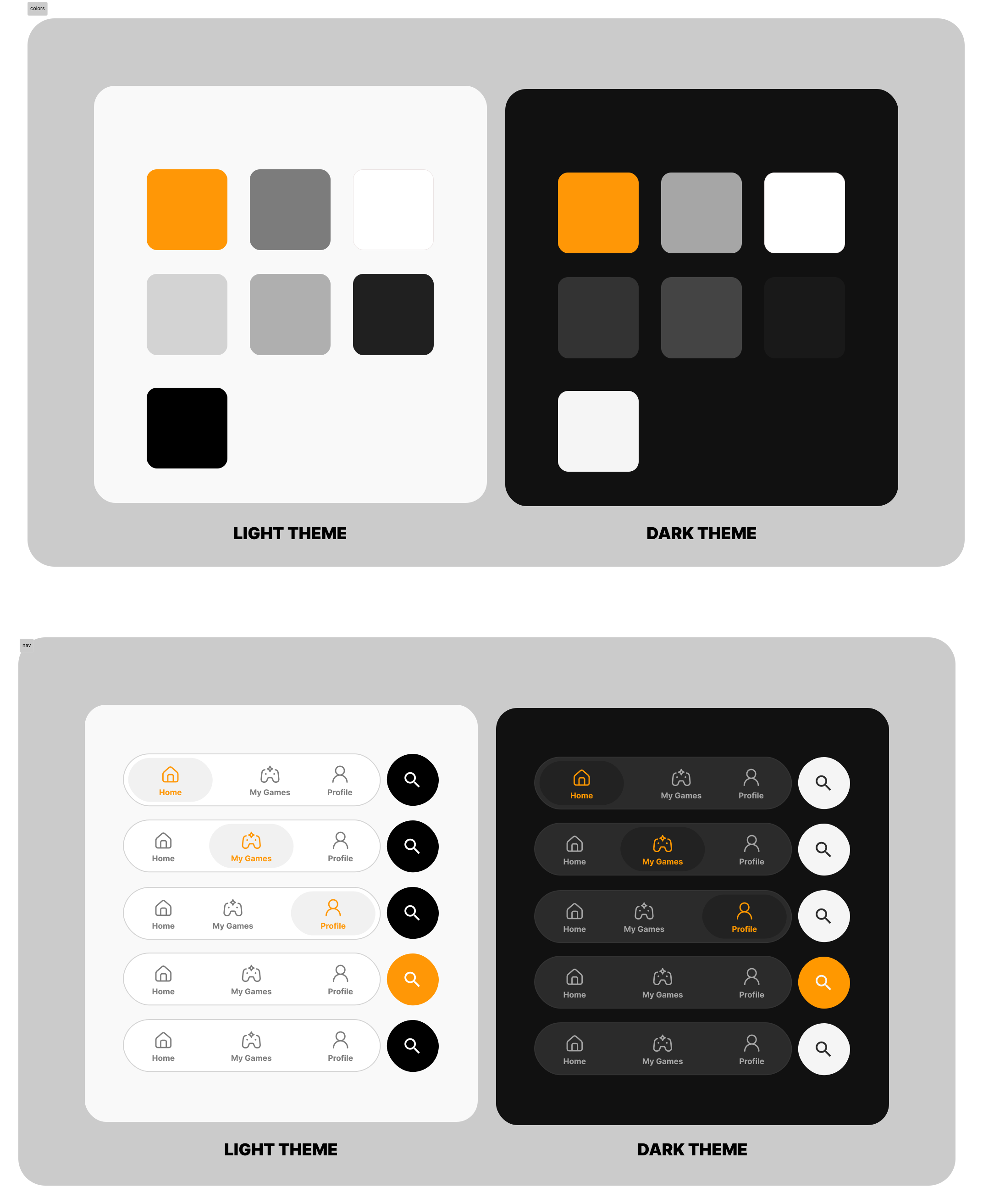
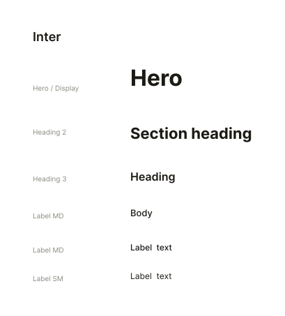
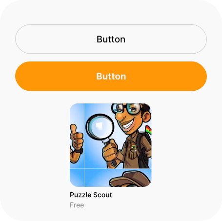
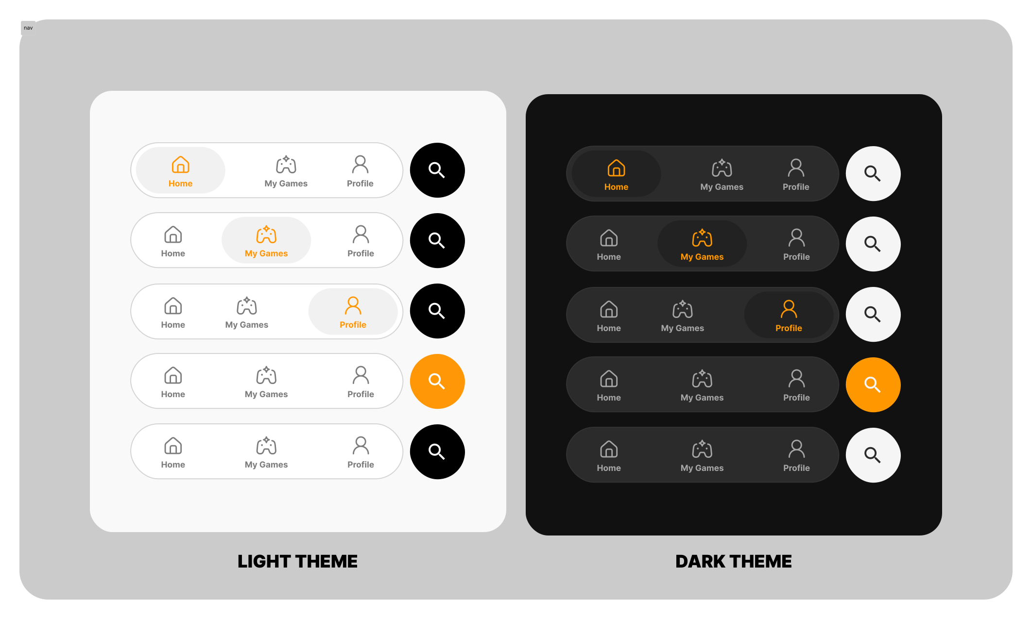
Rather than treating each screen independently, I consolidated the repeated visual and interaction patterns used throughout the redesign into a reusable UI foundation — covering colour, typography, the game card with its primary and secondary CTAs, and bottom navigation. The goal was consistency across the product while making these recurring patterns easier to maintain and extend.
Colour
Typography
Game Card & CTA — Primary · Secondary
Bottom Navigation
Final Screens
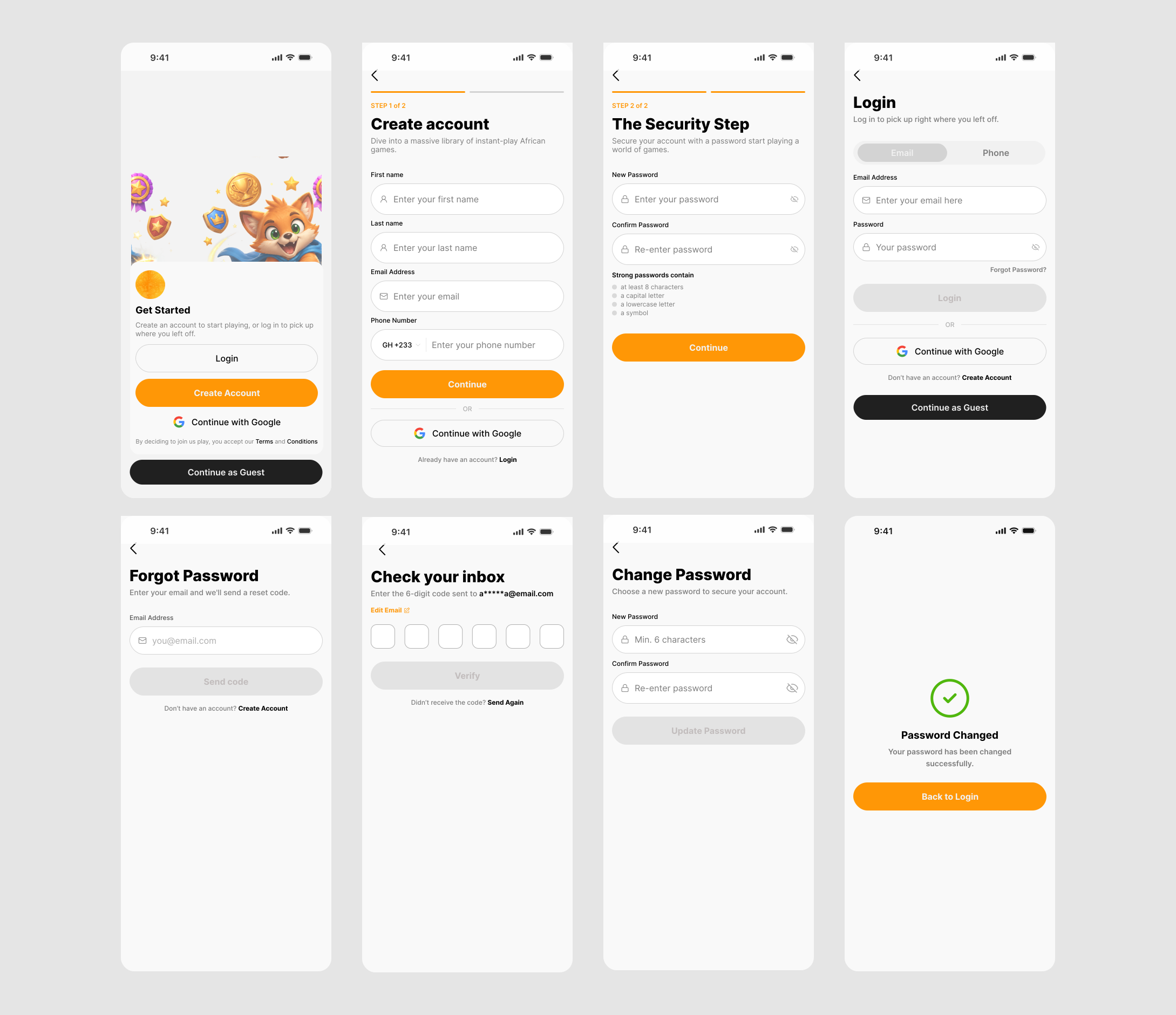
01 Authentication
Onboarding, Create Account, Personal Details, and Sign In.
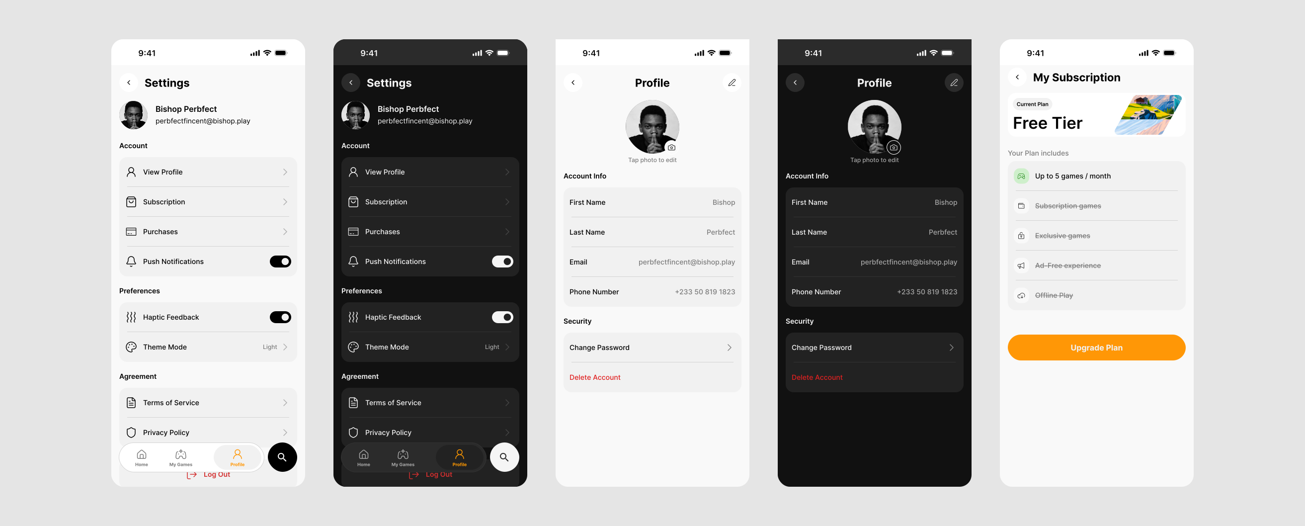
02 Account & Personalisation
Profile and Settings, shown in light and dark theme.
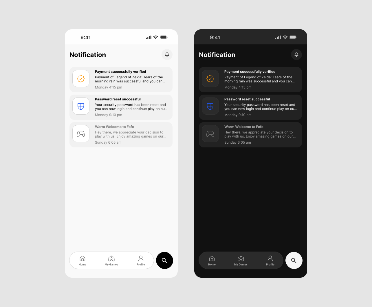
03 Notifications
Notifications, shown in light and dark theme.
Reflection
Designing a product, not just screens
Fefe reinforced how much product quality depends on consistency across connected experiences. Discovery, game details, purchasing, My Games, profiles, and settings each serve different purposes, but they still need to feel like parts of one product. The redesign also pushed me to think beyond individual screens and consider how visual hierarchy, interaction patterns, and reusable UI behave across an entire mobile experience.
Working as part of a design team — Working alongside another UI/UX designer gave me experience owning defined areas of a larger product while maintaining a shared visual direction. It required communicating decisions, aligning on patterns, and considering how individual screens fit into the broader experience.
What I'd do next — With access to users and a development build, I would validate the discovery and purchase journeys through usability testing, then use those findings to refine areas where users experience friction.