Game UI/UX · Mobile · Design System · Team Lead
Spirit Messenger
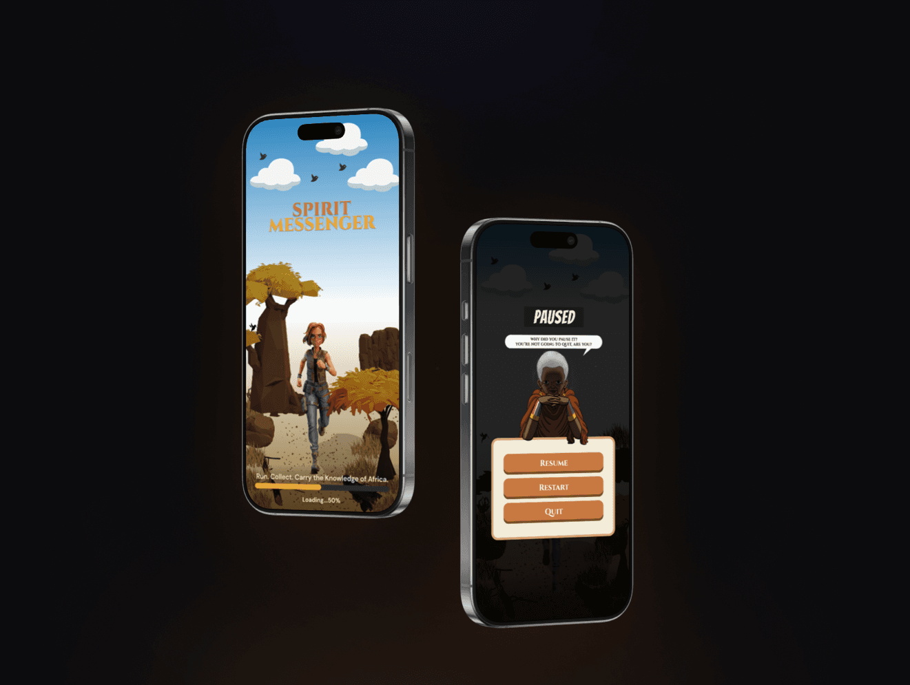
Spirit Messenger is a mobile 3D endless runner that weaves East African culture, storytelling, and proverbs into the gameplay itself.
Overview
Designing a game where culture shapes the experience
Players move through East African-inspired environments, collect Maasai beads, and encounter Swahili proverbs as they run with the interface designed to feel culturally intentional without slowing the player down.
The challenge was to create a UI that remained clear and responsive for players aged 10+, while giving the cultural layer real visual weight within a two-week production timeline.
As Team Lead, I coordinated the artists, designer and developer, working closely with the 2D artist to keep illustration and interface visually consistent.
Research
Let the world carry the story
I contributed to the team's research into East African cultural references — including Maasai beadwork, Kikuyu heritage, Luo storytelling, and Swahili proverbs — which informed the palette, visual motifs, and presentation of cultural content.
I also studied endless-runner conventions in Temple Run and Alto's Odyssey, alongside the team's design document, to translate the agreed gameplay mechanics into interface requirements.
Direction — Let the world carry the story; let the UI support it. This resulted in a minimal HUD, allowing the cultural elements and game environment to carry more of the visual experience.
01
Cultural language
Cultural references shaped the colour palette, bead treatment, illustrations, and presentation of cultural content.
02
Gameplay clarity
Endless-runner patterns informed a lightweight HUD that keeps distance and bead count visible without distracting from movement.
03
Visual direction
The environment and cultural elements carry the visual identity, while the interface stays restrained and functional.
Design Process
Designing the player experience, sprint by sprint
Across a two-week production sprint, I moved from the gameplay HUD through the Fact & Quiz loop — each stage balancing clarity for new players with space for the game's cultural storytelling.
01 — Gameplay HUD
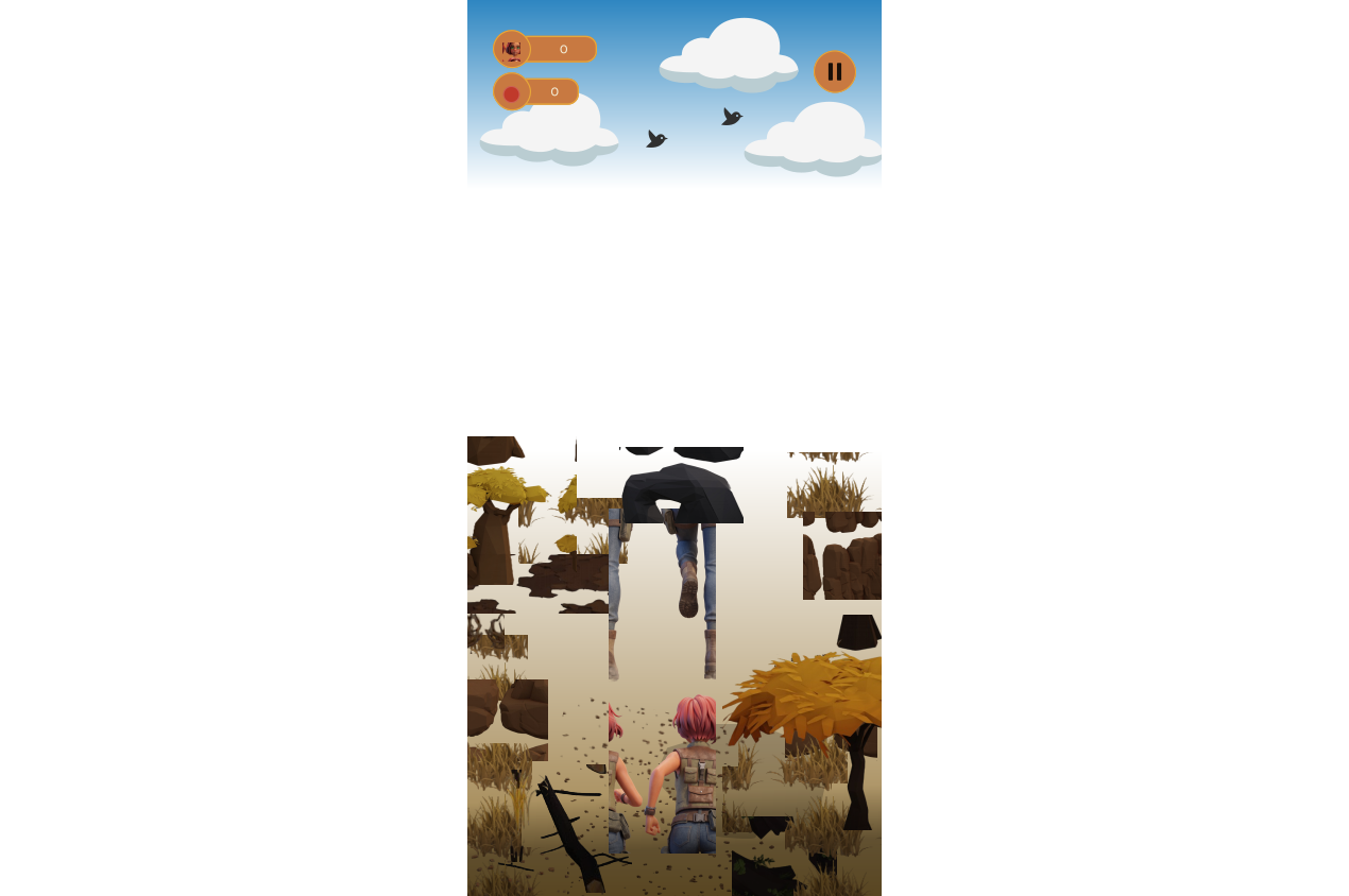
The HUD stays minimal by design — pause control, distance, and bead count — positioned to remain visible without competing with the running character or environment. A tutorial was also designed to onboard first-time players, though the two-week timeline meant it stayed at the design stage.
02 — Teaching Through Fact & Quiz
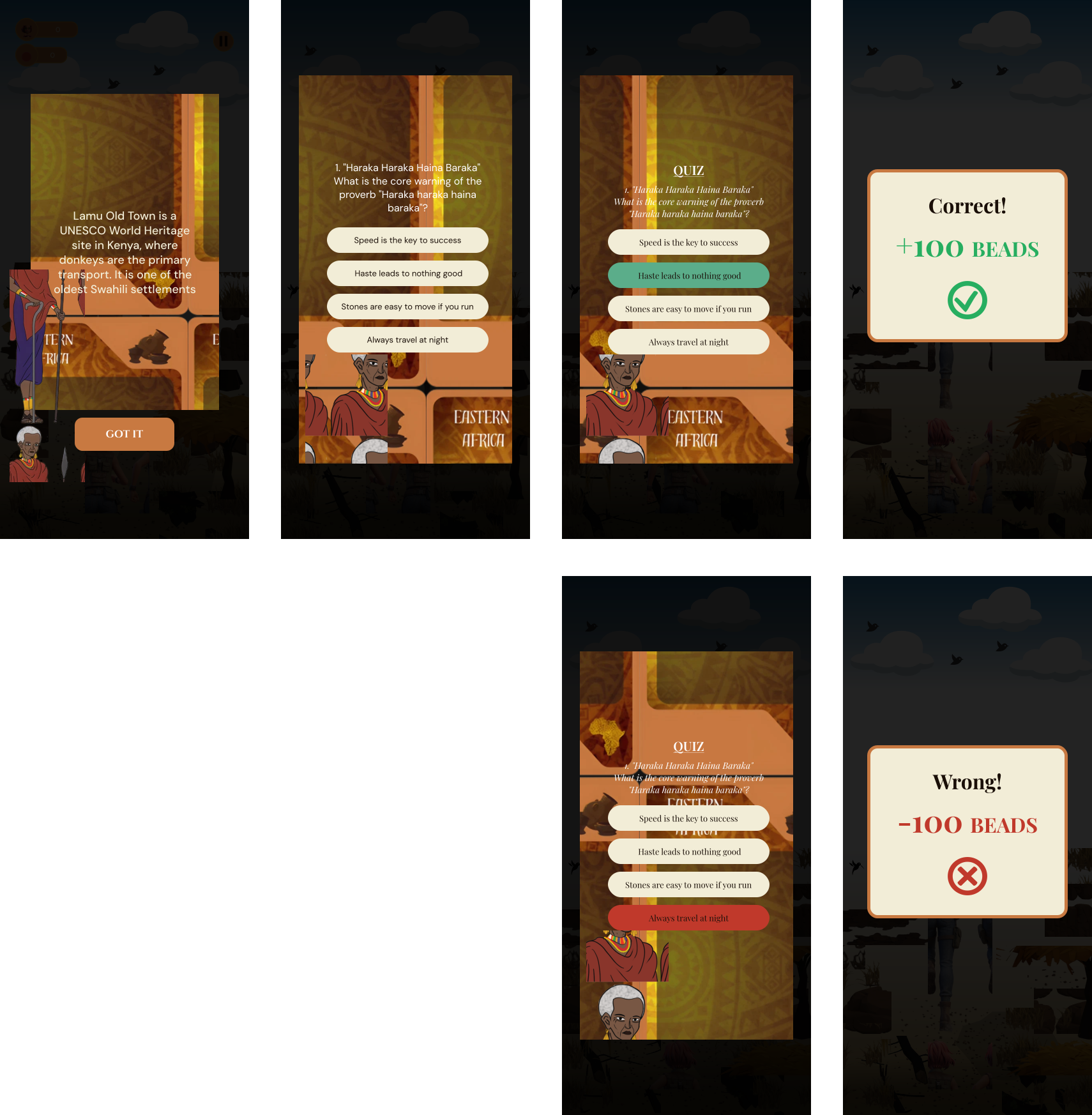
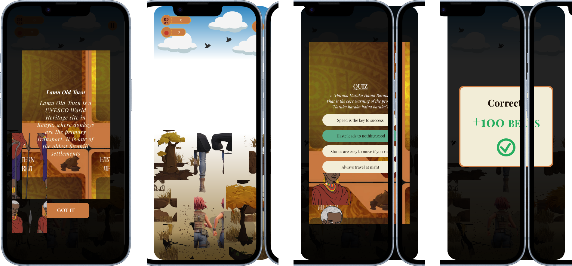
Before each run, a Fact screen introduces a piece of East African culture, followed by a short quiz. Correct answers reward beads; incorrect answers cost them — turning cultural information into an active part of the gameplay loop.
Design System
Building a consistent game UI
The interface was consolidated around a small set of reusable visual patterns to keep the experience consistent across gameplay and supporting screens.
Colour
The palette combines culturally informed earth tones with functional colours for gameplay feedback and states.
Warm Dark Earth
#1A0F08
Maasai Ochre
#C87941
Savannah Gold
#E8A838
Spirit Green
#5BAD8A
Danger Red
#C0392B
Monochrome Grey
#2A2A2A
Monochrome Grey Light
#8A8A8A
Typography
Playfair Display
Cultural / Display
Cinzel
Game UI / Labels
DM Sans
Interface / Body
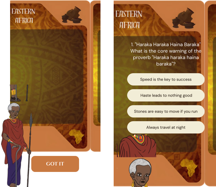
Fact/Quiz Card
Final Screens
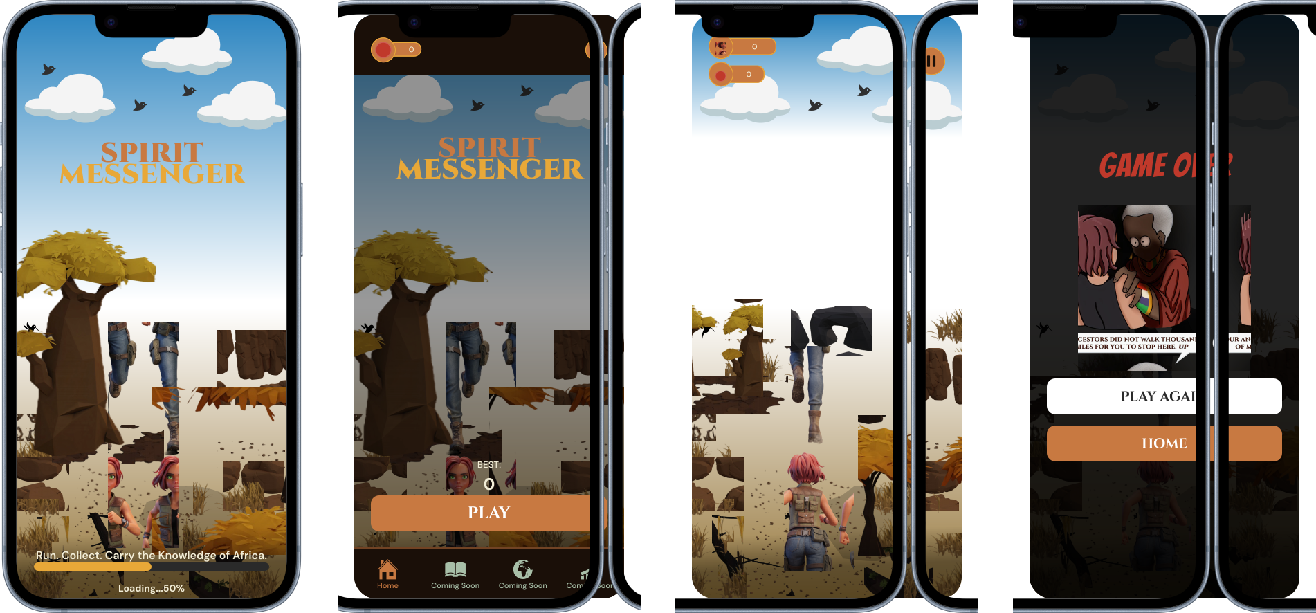
01 — Core Experience
Loading, Home V1, Home V2, Gameplay, and Game Over, shown as one cohesive composition.
02 — Cultural Interaction
Fact → Quiz → Correct/Wrong Feedback.
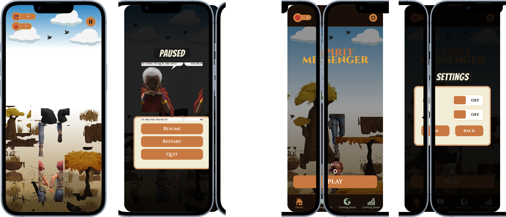
03 — Supporting Experience
Settings and Game Paused.
Reflection
Designing with cultural intent
The strongest decisions came from treating culture as something that shapes interaction and storytelling, rather than simply using it as visual decoration.
Working within a two-week sprint also sharpened my ability to prioritise, collaborate closely with development, and make design decisions around what could realistically be delivered.