UI/UX · Design System · Responsive Web
Mutual
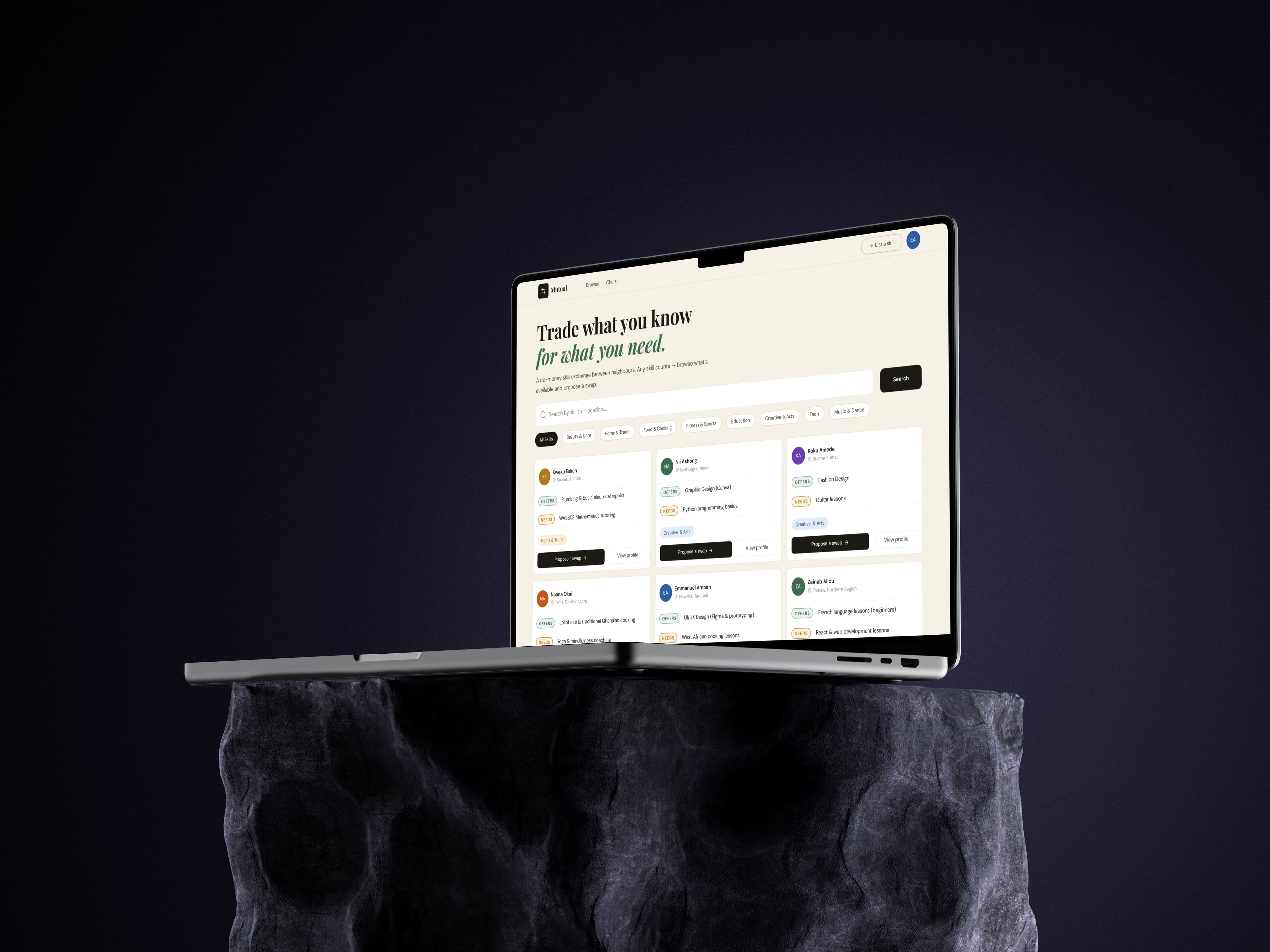
A community skills exchange platform designed to help people trade what they know for what they need—without money changing hands.
Overview
Building a product from design system to deployment
Mutual is a community skills exchange platform that helps people exchange knowledge instead of money.
During my internship at AmaliTech, I led the product design from foundation to implementation building the design system, designing responsive interfaces, and developing the frontend while collaborating with backend engineering.
40+
Reusable Components
50+
High-Fidelity Screens
3
Device Breakpoints
6
Frontend Pages
Research
Designing for trust, not just usability
My visual research was primarily conducted on Dribbble, where I explored community and marketplace interfaces to understand browse patterns, card structures, and ways of presenting users and their skills.
I also looked at existing service platforms as references. Unlike money-based marketplaces, Mutual needed to feel more like a community where people exchange value directly.
These insights informed the visual direction and the core browsing, profile, and proposal experiences.
01
Warm over transactional
The visual direction should feel approachable and community-driven rather than like a conventional marketplace.
02
Browse before committing
Users should be able to explore skills and profiles before being asked to authenticate.
03
Make the exchange model obvious
Showing what someone offers alongside what they need helps communicate the concept immediately.
04
Trust through context
Profiles, skills, and messaging needed to give users enough context before they proposed an exchange.
Design Process
From flows to production
I started by mapping the core user journeys, then moved through wireframes and high-fidelity designs before translating the system into the frontend.
The design and development happened in parallel, allowing me to test design decisions against real implementation constraints throughout the project.
01
Build the foundation
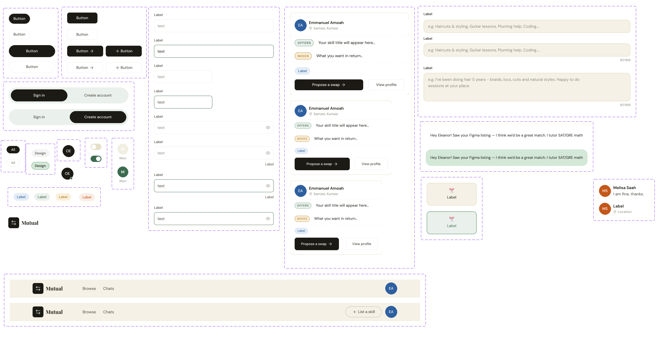
I created the design system before designing the full set of screens, establishing typography, colour, spacing, layouts, and reusable components. In total, this produced 40+ reusable components.
02
Design the core flows
I designed the main experiences across desktop, tablet, and mobile: Authentication, Browse skills, Skill details, Profiles, Post a skill, Proposals, and Messaging.
03
Design beyond the happy path
The interfaces accounted for different UI states, including empty, loading, validation, and edge cases.
04
Design → Build
I translated the designs into the Next.js frontend and collaborated with the backend developer to integrate authentication, profiles, listings, and messaging.
Design System
A reusable foundation for the entire product
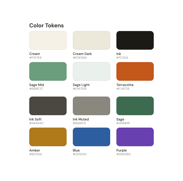
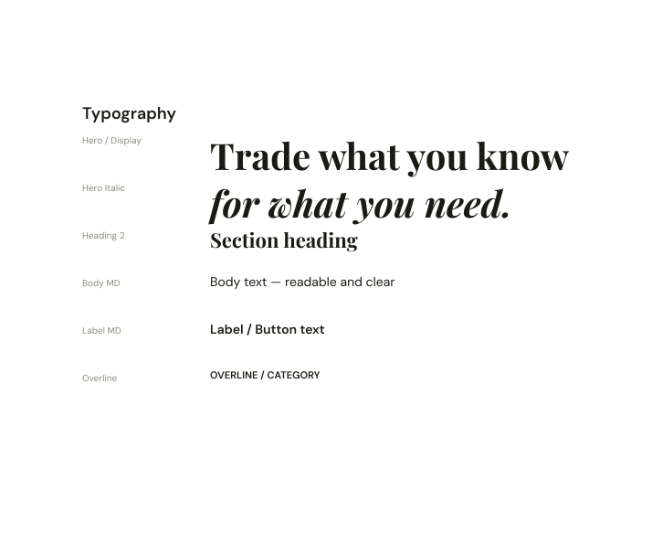
The design system established a consistent visual language across Mutual while making the interface easier to scale and implement.
Colour
Typography
Components
Final Screens
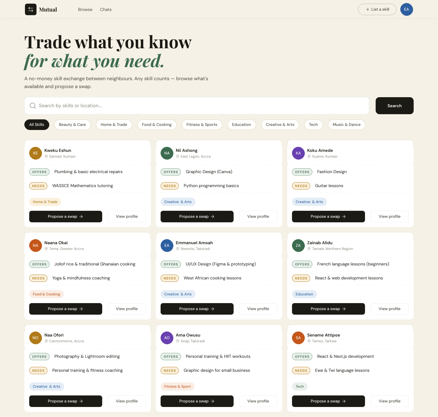
Discover
Browse skills and explore what people offer and need.
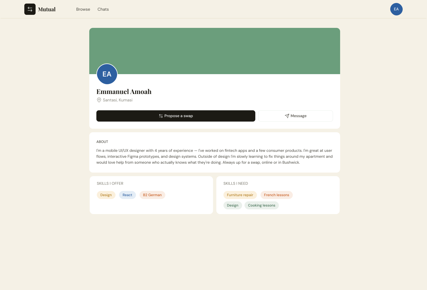
Connect
View profiles and understand potential exchange partners.
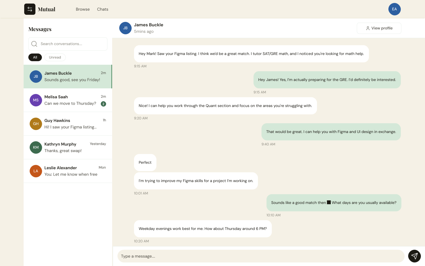
Exchange
Create proposals and communicate through messaging.
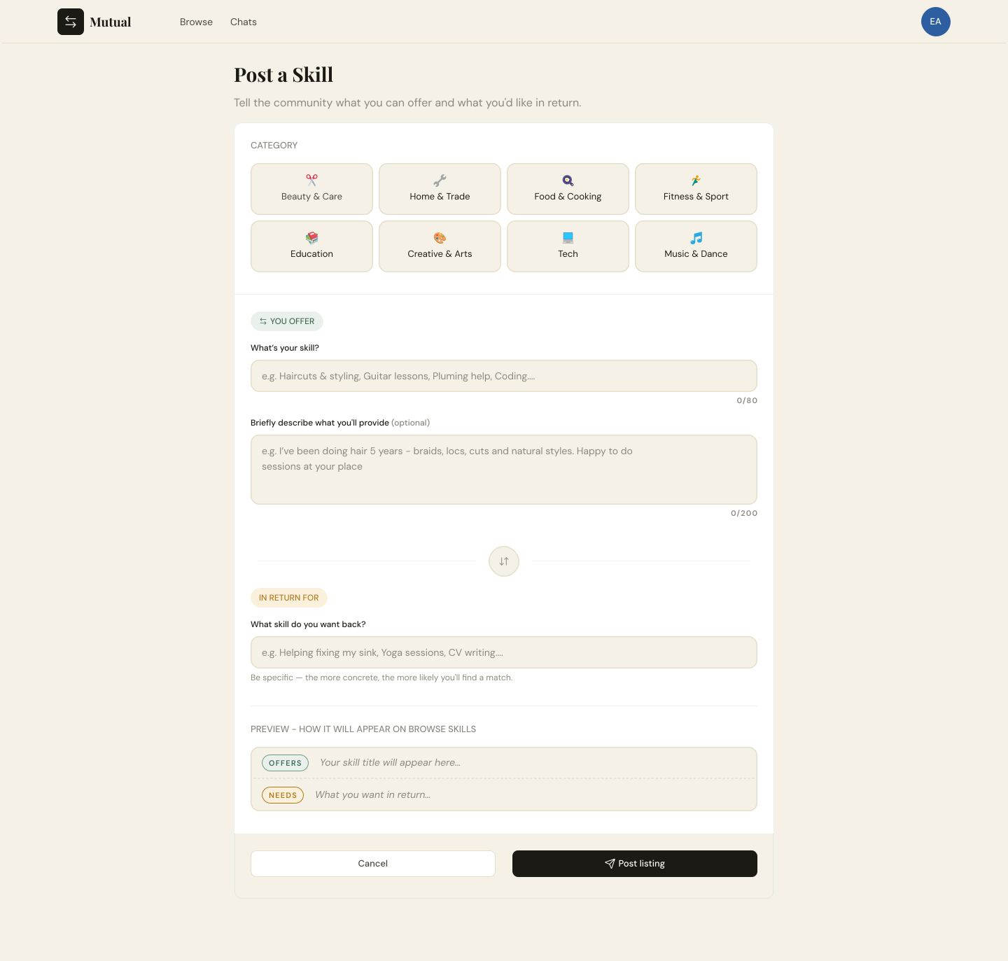
Create
Post and manage your own skills.
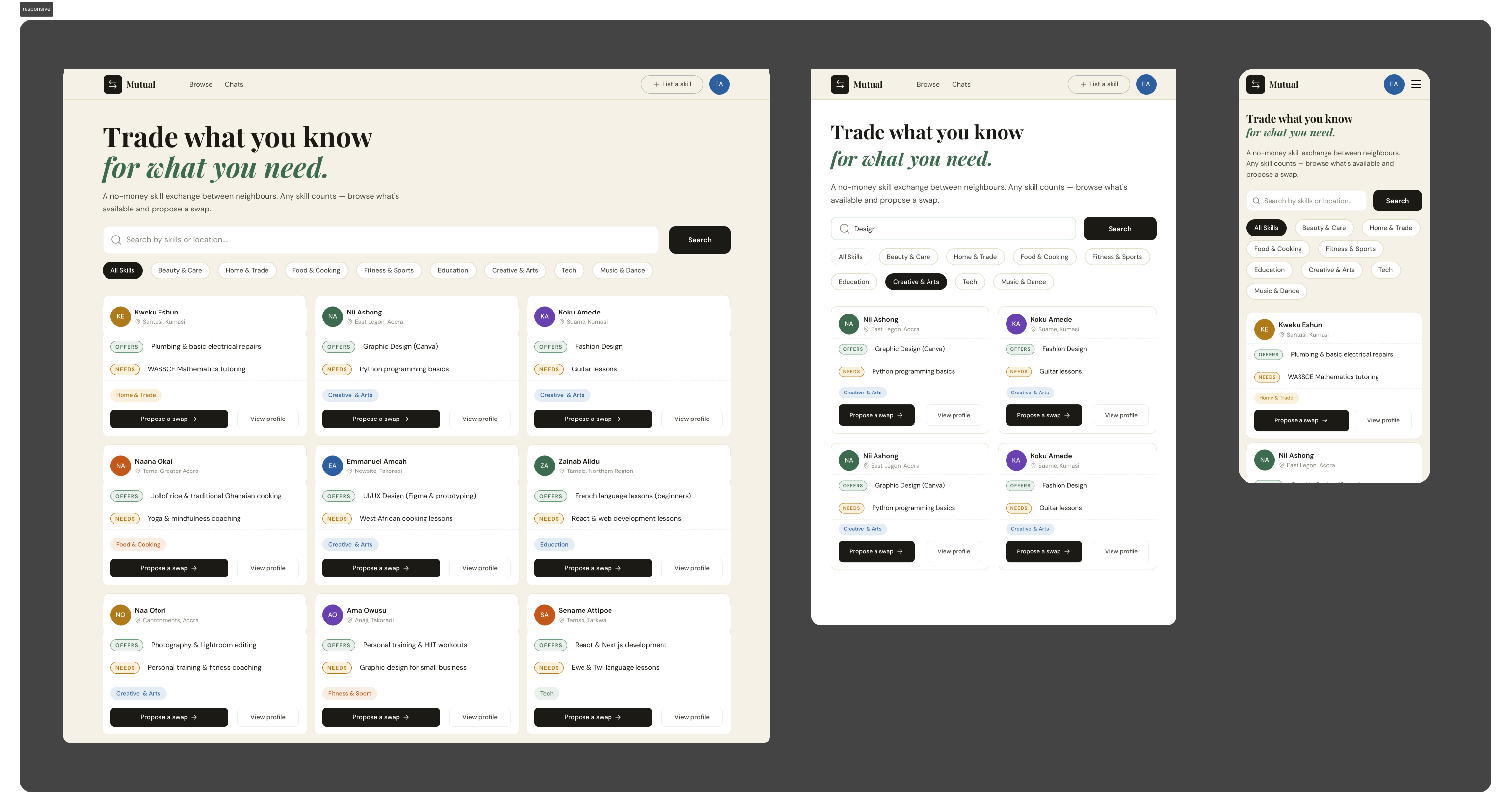
Responsive
Show the same core experiences across desktop, tablet, and mobile.
Reflection
Designing with implementation in mind
Mutual pushed me beyond designing interfaces in Figma. I was responsible for both the product design and frontend implementation, which meant thinking about responsiveness, component reusability, and technical constraints from the beginning.
Working closely with backend development also showed me how closely design and implementation are connected. Decisions that looked simple in Figma could have very different implications once built.
Testing the product with my supervisor and users reinforced the value of iteration. Feedback led to changes such as adding direct messaging from profiles, connecting proposals more closely with Messages, and fixing unread-message behaviour.
The biggest takeaway: designing a product isn't just about making the interface look right—it's about making the experience work in the real world.