UI/UX · Design System · Web & Mobile · In Progress
MTS Operations Reporting System
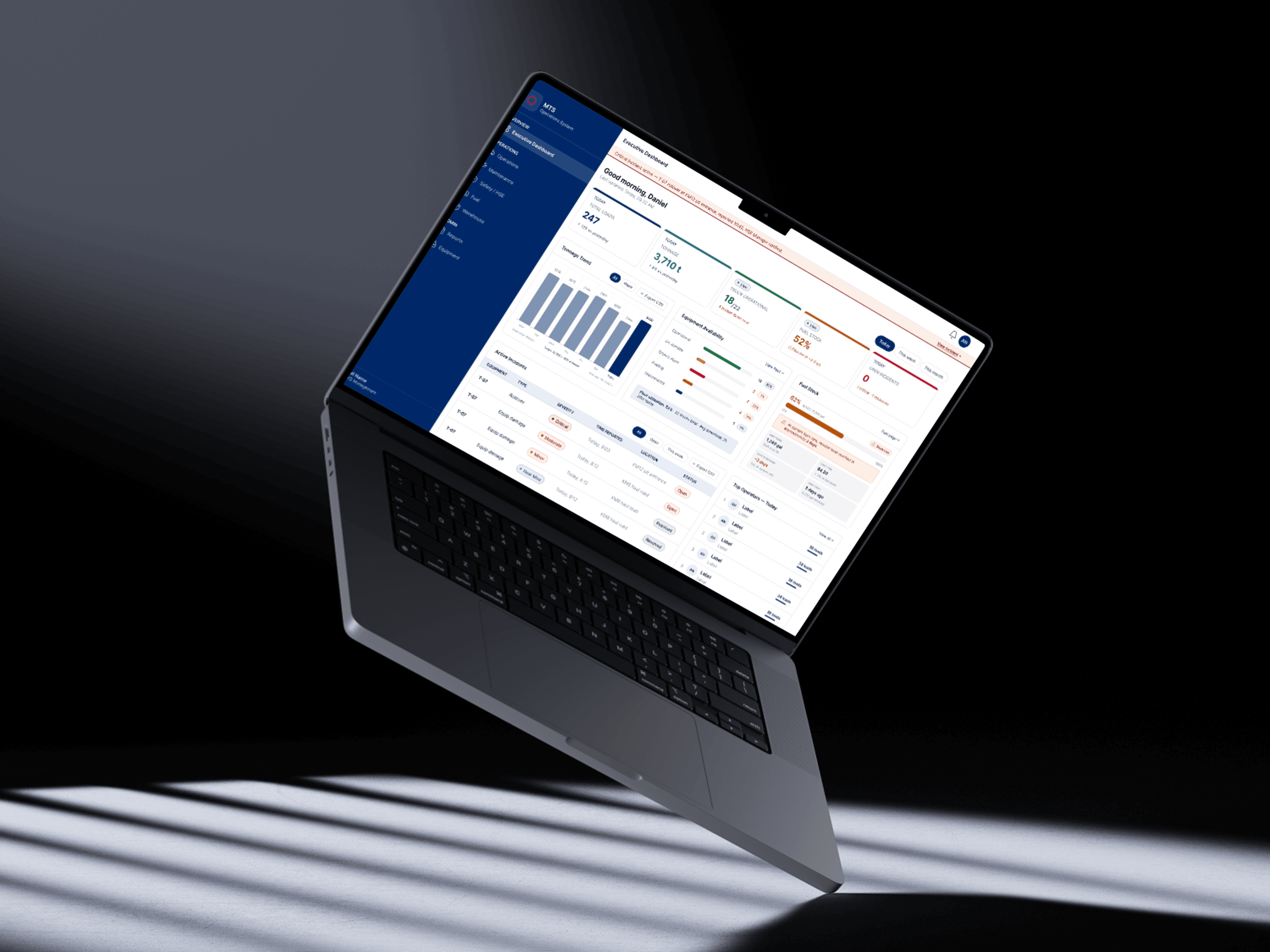
A dual-platform operations reporting system for a mining logistics contractor; 8 modules, 200+ components, 180+ screens.
Overview
Turning field data into decisions
MTS is a dual-platform operations reporting system built for a mining logistics contractor, replacing scattered spreadsheets and paper reports with a single system spanning 8 modules, 200+ components, and 180+ screens across web and mobile.
This project is still in progress. The scope is large enough that the design system had to come first: a shared component library that field and back-office teams could both build on as new modules are added.
Research
Designing for the field, not just the office
Operations staff use this system from mining sites on tablets and phones, often with poor connectivity, while back-office teams use the same data on desktop. Research focused on where those two contexts pull in different directions.
01
Density works at a desk, not in the field
Dense data tables that worked well for back-office review were unusable on a tablet in bright outdoor light. Field views needed a simplified, higher-contrast alternative.
02
Offline isn't optional
Site connectivity dropped constantly. Any field report flow that assumed a live connection risked losing submitted data entirely.
03
Roles need different defaults, not different apps
Site supervisors, drivers, and back-office staff needed very different default views, but maintaining one system was still preferable to separate apps per role.
04
Modules need to feel like one system
With 8 modules being built over time, inconsistent patterns between them would compound quickly. Shared components mattered more here than in a smaller product.
Design Process
Component library before modules
Given the scale, the process prioritized a shared component library early, so each new module could be assembled from proven patterns instead of designed from scratch.
01
Mapping modules and shared patterns
Audited all 8 planned modules up front to find recurring patterns, tables, status indicators, report forms, before designing any single module in isolation.
02
Building the component library
Designed a library of 200+ components covering both dense desktop views and simplified field views, so every module draws from the same set.
03
Rolling out module by module
Shipping modules incrementally against the shared library, refining shared components as real usage surfaces gaps, rather than freezing the system too early.
Design System
A system built for scale
With 200+ components spread across 8 modules, tokens had to be strict enough to keep everything consistent as new screens get added.
Primary
Core action color used consistently across desktop and field views for primary actions and active states.
Neutral
Grayscale ramp tuned for dense data tables on desktop and higher-contrast field views on mobile.
Semantic
Status colors for report states, sync status, and alerts, shared across every module for consistency.
Final Screens
Reflection
What's still ahead
Building the component library before most modules existed felt slow at first, but it's already paying off: newer modules are shipping faster than the earliest ones did.
This project is ongoing. The next stretch is rolling out the remaining modules and stress-testing the offline field flows with real site connectivity, not just simulated conditions.